This user-guide helps you manage your business with the statistics module. The module processes various parameters, such as available resources and workloads, to provide a comprehensive picture of what your needs are and where these requirements are coming from. With this module you can find the available resources, consumers workloads and allocate their skills based on the requirements of an organization. By the end, you should have a good understanding of how to use this statistics module.
What is the Statistics Module?
The statistics module is a user-friendly tool that assists you in analyzing the dynamics of workforce, resources and workloads at your business.
Statistics Module helps the client managers answer the following 4 important questions:
- Do we have enough resources available to welcome 1, 2 or 3 new members to our team?
- Which days of the week are usually less or more busy?
- What is the team’s workload?
- Is the workload distribution fair?
These statistics have a module with multiple filters that will display the resources availability and consumers availability. Resource availability plays a fundamental role in the statistics module. Knowing the number of resources available at any given time is an important factor in deciding how to distribute and allocate the right assets. This statistics module has two main components: Resource availability and Consumer availability.
Resource availability provides you an overview of resources’ schedules that are available within a fixed time range and Consumer availability provides a clear picture of consumers’ availability or workload on a given time span.
The Statistics module allows you to find and allocate the right resources. With this feature you can easily analyze your workforce and available resources across your enterprise.
How to use the statistics module
This user guide has been designed to help you to use the Statistics module. It will guide you through the basic navigation and some of the key features of Team2Book. It will also provide some useful hints and tips to make your use through the statistics module as easy as possible.
To start the statistics module from the beginning, select the Members Area in the Team2Book homepage navigation, and tap the members area to open the client dashboard.

Selecting the Client Dashboard will open a pop up, which displays all the client details. Scroll down through the client dashboard page and Select statistics to view the corresponding page containing the key features you are looking for.
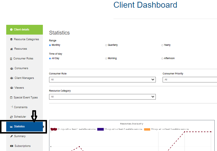
Ensure the Statistics tab is selected from the Client Dashboard. You will notice the menu provides a list of filters covered in this module.
STEP-1: Select the Range and Time of day
The range and time of day filter at the top of the statistics module brings up a sub-options menu. There are a series of helpful buttons on the Range and Time of day filter.
Range – is the time span of the statistics data. The range contains three options Monthly, Quarterly, and Yearly options.
The Yearly Options:
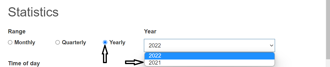
The number of years the statistics module data displays depends on the client’s Team2Book membership plan. The free Team2Book plan will display only the current year statistics data. Whereas the other paid plans display the current and past year statistics data. Click the year tab and Put your cursor where you want the year to view the statistical data.
The Quarterly Options:
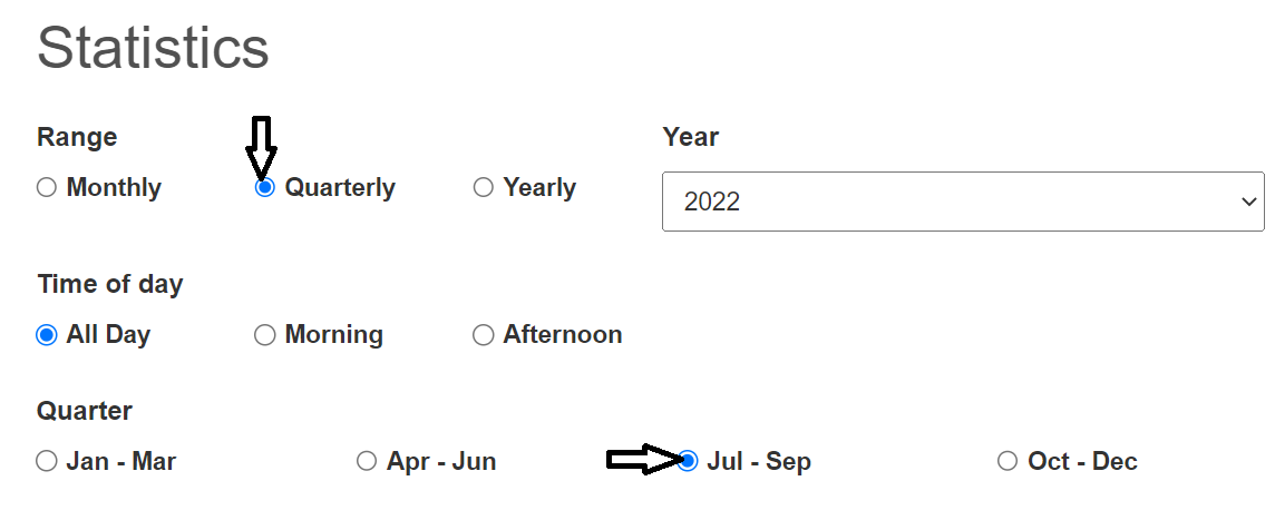
When you select the quarterly radio button the quarter radio buttons will be displayed. There are four quarters in a year. The statistical data will be within a three month period (i.e. one quarter of one year); 1) Jan – Mar, 2) Apr – Jun, 3) Jul – Sep, and 4) Oct – Dec. By default our system displays the current quarter statistics data. In the quarterly range options, you can select any of the four quarterly ranges to view the statistics data.
The Monthly Options:
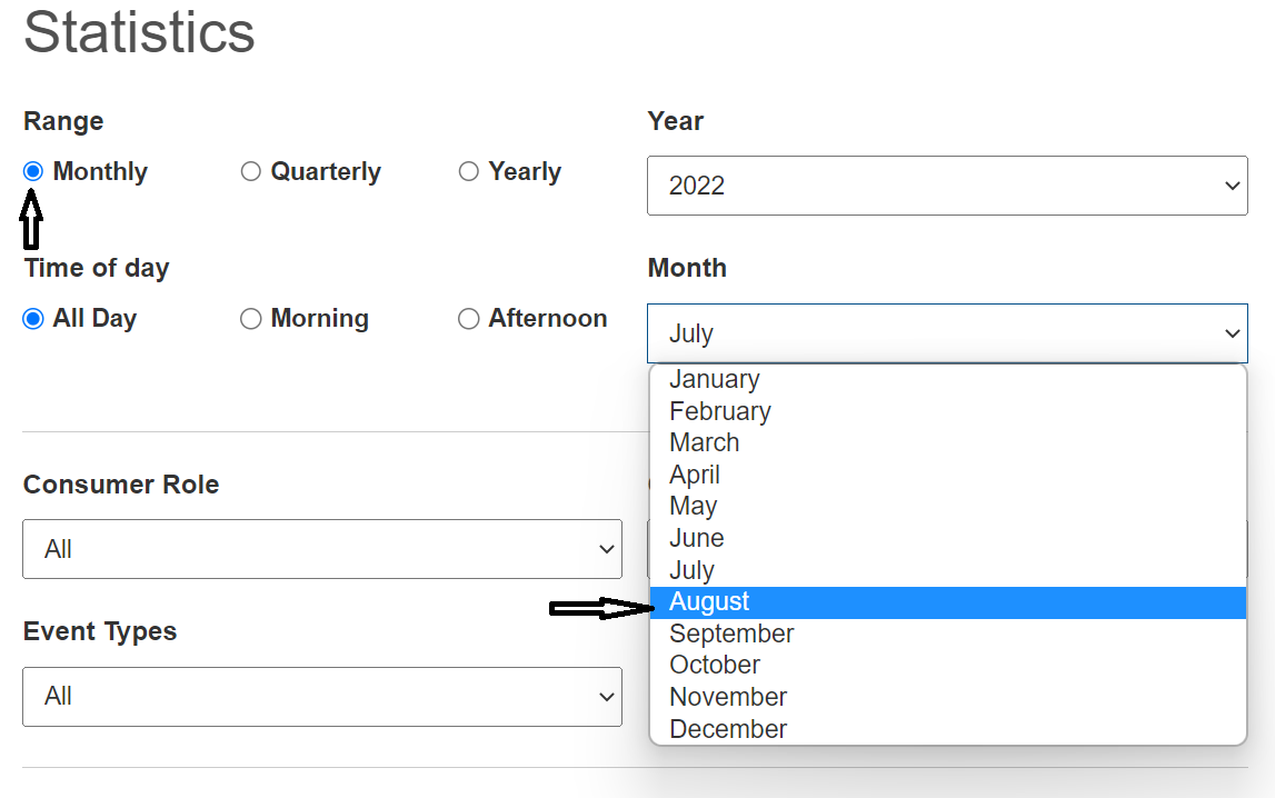
When you select the monthly radio button, the month select field will be displayed. By default the current month is selected. You can choose any of the months to view the statistical data.
Time of day filter:
This filter allows you to specify the specific time range of the day. You can filter the statistical data by clicking the time of day here:
- All day: Between client’s opening time and client’s closing time

- Morning: Between client’s opening time to lunch time

- Afternoon: Between lunch time to client’s closing time

By default our system displays the all day option, you can choose the other options (Morning, and Afternoon) to display the statistical data.
STEP 2 – The Consumers Availability Statistics Data Filter
This section helps filter the consumer availability statistics data. This allows the client manager to see the number of work days for each consumer. You can filter the target consumers by their role and priority. In addition you can filter the statistics data based on the event types.
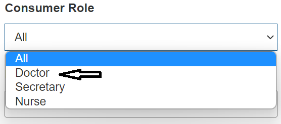
Consumer Role
The consumer role select field displays all existing consumer roles. By default the system selects all consumer roles. Tap the select field to select any of the available consumer roles.
Consumer Priority Filter
The consumer priority filter enables you to filter consumer statistic data by the consumers’ priority. Tap the consumer priority select field to select a specific consumer priority. By default all consumer priorities are selected.

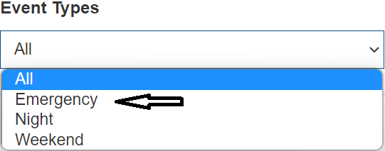
Event type Filter
The Event type filter allows you to specify the target event types. Tap the event type select field to select the target event type. By default the system selects all event types.
STEP-3 : Resource Availability Statistics Data Filter
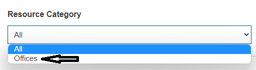
The resource availability statistics data filter section enables you to filter resources availability statistics data. Currently the section has one filter, which is the resource category filter (for example Offices, lab equipment, etc.).
Tap the resource category select field to select the target resource category. By default the system selects all resource categories.
Results of the statistical Data
The statistics module includes an extensive set of reports in terms of line and pie charts, which provide insights into the number of days with available resources and number of work days for each consumer. This is the report that allows client managers to quickly visualize the utilization of their workforce, from across all available resources.
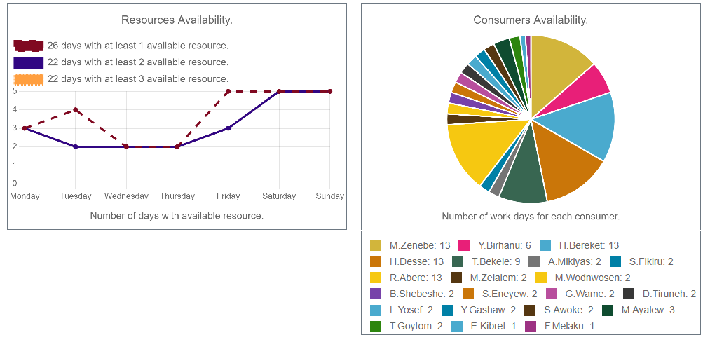
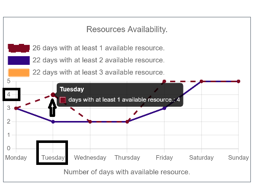
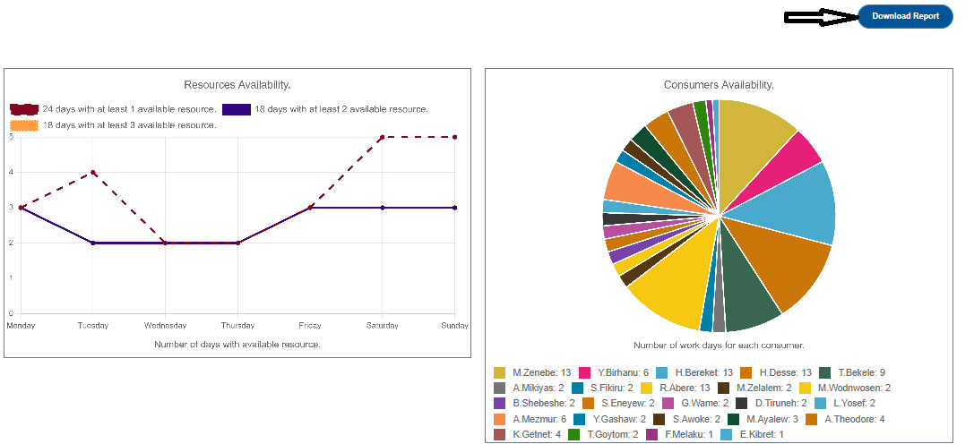
The resource availability line graph comprises three data sets:
- The number of days with at least 1 available resource: Represented by Burgundy color with dashed line for each week day.
- The number days with at least 2 available resources: Represented by Blue color with solid line for each week day
- The number of days with at least 3 available resources: Represented by Yellow color with dotted line for each week day
Each line graph tells about the number of days with available resources. The line graph comprises two axes known as ‘x’ axis and ‘y’ axis.
- The horizontal axis is the days in a week
- The vertical axis is the amount of days within the given available resource
The intersection point of the label on the number of days in a month and days tells about the available resource.
We can mouse over the resource availability line chart to display the available resources and to view the number of days with available resources.
Observe the line graph shown below. Let us read it and list out the key observations from the line graph.
- The graph provides information about the number of days with available resources.
- Displays available resources over a specified time interval.
For example, in the above graph the intersection on Tuesday and 4 shows that the burgundy color data set, which is days with at least 1 available resource, is 4. We can interpret this Statistical data for each day using the data set.
Example on interpreting a resource availability chart
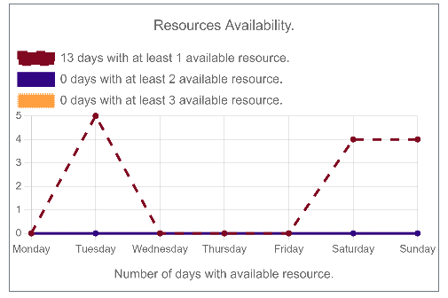
The resource availability chart shown below indicates that there are 13 days with at least 1 available resource in August. Among these days, 5 are on Tuesday, 4 are on Saturday, and 4 on Sunday. From the chart you can determine that a new consumer can be added and scheduled to Tuesday, Saturday, or/and Sunday in August.

The consumer availability pie chart shows how the total amount of consumer availability is divided between consumers. The whole pie chart represents the workloads. Each categorical value corresponds with a consumer availability of the circle, and the size of each slice (both in area and arc length) indicates the number of workdays for each consumer.
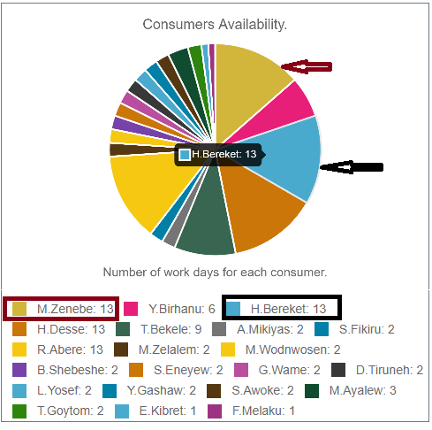
The various colors in the pie chart are the same as the consumer Teamup sub calendar color. The pie chart depicts the number of workdays for each consumer. We can mouse over the Consumer Availability pie chart to display the names of the consumer and to view the number of workdays for each consumer. For Example, we can see that M. Zenebe, represented by the purple slice, has 13 workdays, and H. Bereket (walnut/ burgundy color) with 13 workdays.The legend at the bottom left shows consumers name. The first initial of the consumer’s first name and the last name is used in the legend.
You can tab the legend in the consumer availability pie chart and in the resource availability line chart graph to delete and view the other result. For example here in the graph below when you tab the burgundy color legend, the line chart result will be deleted and you can have an easy view of the remaining line chart result. When you want to review the result you can just tap the legend back and you can have all the results.

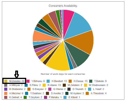
In the pie chart here, when you tab the name legend at the bottom of the pie chart for example when you click M. Zenebe, the consumer availability of the M. Zenebe will immediately be deleted, and you can view the other consumer availability. When you want to review M. Zenebe you can just click the name in the legend once again and you can view the consumer availability back.
The user can also print to a PDF the statistics data. When you click the download report button you will automatically get a pdf statistical report data based on your time parameter.
The download link will automatically download the pdf version of the statistics report with your corresponding preference, parameters and filters.
